7 Must-Have Revenue Intelligence Dashboards
If you're just starting out with tracking your revenue data, these are the 7 must-have dashboards that you should start with. Learn why they're important and what to include.

Try Whaly
Thousands of users rely on Whaly every day to monitor and improve their revenue. Join them now!
No matter the size or age of your company, it’s critical to start making sense of your revenue data now if you want to grow and succeed. It’s the only way to track your performance, understand what’s going well, what isn’t, and troubleshoot accordingly. Trust us, setting up your data stack so that you can visualize your data in real-time will be well worth the initial time, energy, and investment that’s required. With all the BI platforms and no-code / low-code tools out there, it’s never been easier to get up and running with your data, even if you don’t have technical resources.
The best way to display your data for ongoing monitoring and visibility, is in a series of dashboards. Once you have a BI platform in place that has visualization and dashboarding capabilities, it’s time to actually create those dashboards. But how to get started figuring out which dashboards to create first, and what types of metrics should be included in each dashboard? This blog article answers all these questions, and explores which dashboards to create and how.
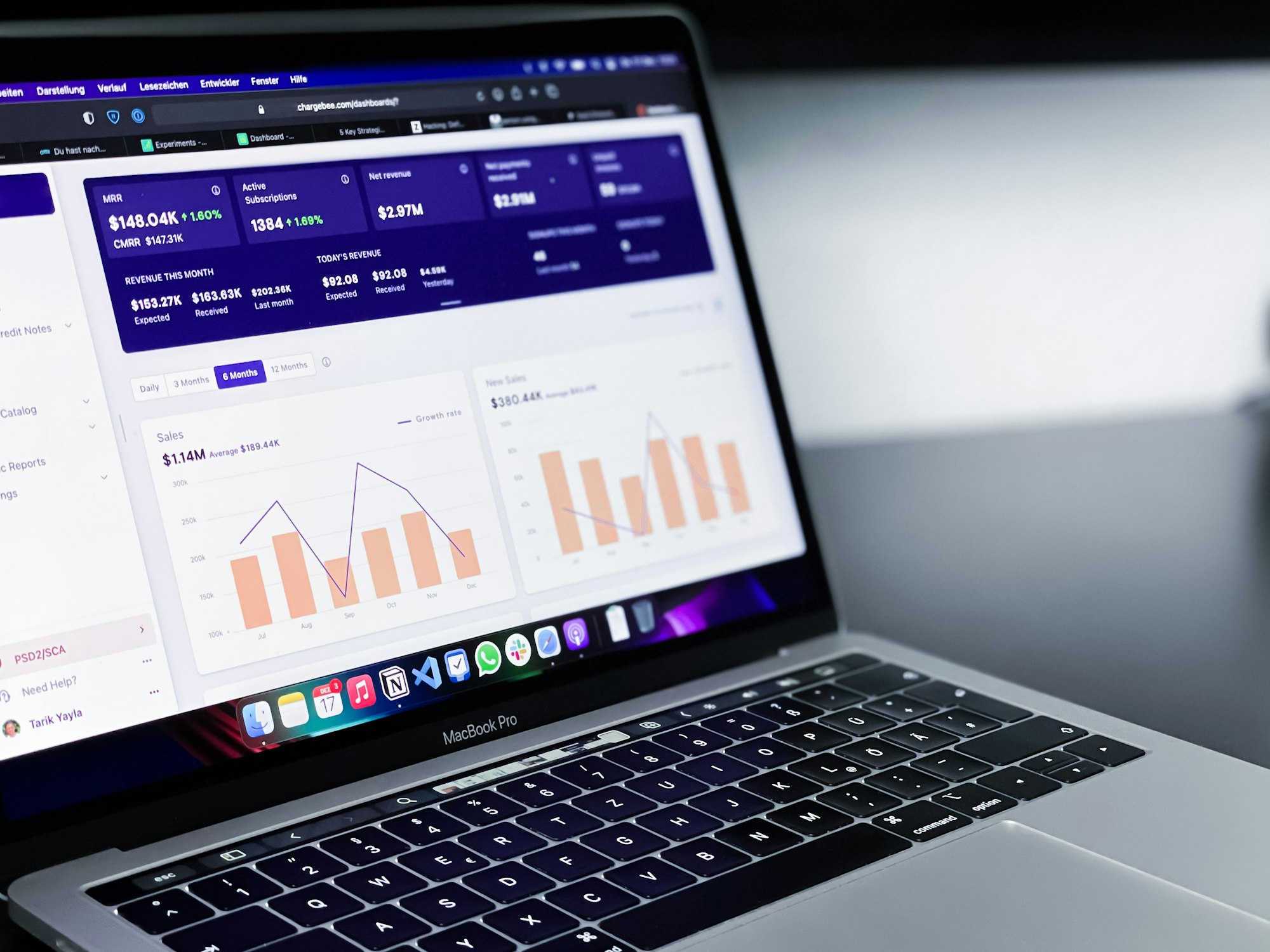
1. The “Executive” Dashboard: Overall Revenue & Finance
What is it and why is it important?
A dashboard that monitors a company’s overall revenue and finance is critical, and is generally one of the first dashboards companies put in place. This serves as the dashboard that founders, leadership teams, and investors will refer to to understand overall health & heartbeat of the company, as well as growth trajectory. Based on trends and patterns identified from this dashboard, leadership teams can make better decisions that steer the company in the right direction.
Who is it important for?
Founders, leadership teams & C-suite, Revenue Operations Leads, Investors
Which charts / metrics should appear on this dashboard?
- Monthly Recurring Revenue (MRR) / Annual Recurring Revenue (ARR)
- MRR Growth rate
- Customer Acquisition Cost (CAC)
- Gross merchandise volume (if applicable)
- Customer Lifetime Value (LTV)
- Number of active subscriptions (accounts)
- Number of active users
- Average Revenue Per User (ARPU)
- Churn rate (logo and/or revenue)
2. Marketing Performance Dashboard (Overview)
What is it and why is it important?
The marketing dashboard tracks campaign performance across different channels, and ties it to spend and revenue impact. This is important because it helps CMOs and marketing teams understand what’s working, and what’s not, and more accurately plan budgets for next year, based on real learnings from previous activities and results. It’s easy to throw marketing dollars at all sorts of initiatives and channels, which can be hard to measure. Since there are many digital and social marketing activities that already track traffic and conversions, it’s never been easier to set up a marketing dashboard.
Who is it important for?
CMOs, Marketing Managers, Leadership Teams, Revenue Operations teams
Which charts / metrics should appear on this dashboard?
- Traffic sources chart by channel or type (Paid Ads, Web Referral, Influencers, User Referral, Search, Direct)
- Funnel chart that provides percentages for:
- Website conversion rate (traffic / visits)
- Number of inbounds leads
- Leads to MQLs
- MQLs to SQLs
- SQLs to Opportunities / Deals
- Deals to Closed Won
- Any other goal KPIs that are specific to your company
- Total planned budget
- Budget utilization rate
- Return on investment (spend on campaign vs. revenue generated from channel)
3. Team-Level & Rep-Level Sales Dashboards
What is it and why is it important?
Sales performance dashboards at the team-level and rep-level showcase outbound prospecting efforts, what’s in the pipeline, and conversion rates across stages. Having a way to monitor these efforts and pipeline status in real-time can help sales teams answer questions such as “Do I need to hire more sales reps to achieve my sales objectives?” or “How much should be forecasted based on performance from previous quarters?”
There are multiple dashboards that can be created to illustrate important sales metrics. There are 2 main ones to get started with: 1) a team-level dashboard, that shows the current pipeline and deals closed to see if the overall team quota can be hit in the period (quarter, month, etc.), and 2) a rep-level dashboard that shows performance by rep, which can help Sales managers understand who is performing well, and who needs some extra support. It helps the weekly sales meetings run more smoothly, and helps each individual rep better understand how they’re performing and what’s expected of them — all based on facts and numbers.
Who is it important for?
Head of Sales, Account Executives / Sales Reps, Business Development Managers / Reps (BDRs and SDRs), Founders, Leadership Teams, Revenue Operations teams
Which charts / metrics should appear on the Team-level dashboard?
- Overall Revenue Amount
- Closed Revenue (for this month or quarter)
- Expected Revenue (Forecast - for this month or quarter)
- % to Goal
- New deals (for this month or quarter)
- New deals per month (within fiscal year)
- Number of deals in pipeline (for this month or quarter)
- Top current deals
- Lost deals count (for this month or quarter)
- Conversion rate
- Line chart with sales trend (closed won revenue) against forecast
Which charts / metrics should appear on the Rep-level dashboard?
- Overall forecasted amount per rep
- Current revenue per rep
- % to overall goal for each rep
- Closed won revenue this month or quarter, by sales rep (by new closed revenue, or expansion revenue). This chart can be shown in a leaderboard style for extra motivation.
- Retention per rep
- Number of prospecting activities completed per rep (calls, emails, LinkedIn messages)
- Number of new accounts onboarded by rep
You can also consider filtering information by industry, territory, to try to derive patterns that might be happening based on geographical or industry factors. For example, during Covid, there was a boom in online e-commerce (over brick & mortar retail stores), which can help sales team understand where to focus. Filtering the data by time also enables sales teams to gauge performance based on past history. If there is a decline in performance, sales managers can dive into troubleshooting mode and explore the data further.
4. Pipeline Health Dashboard
What is it and why is it important?
A Pipeline health dashboard allows sales teams to understand the average time spent in each stage of a deal, by sales rep, to see if the pipeline is properly being engaged. If the opportunities are not being nurtured actively at each stage, the deal may rot and the likelihood of actually converting it will be very low.
Who is it important for?
Head of Sales, Account Executives / Sales Reps, Business Development Managers / Reps (BDRs and SDRs), Founders, Leadership Teams, Revenue Operations teams
Which charts / metrics should appear on the Team-level dashboard?
- Number of days in Discovery stage
- Number of days in Demo stage
- Number of days in Proposal stage
- Number of days in Negotiation stage
- Number of days in Legal stage
- Number of days since first meeting (total number of days of deal)
- Show this as an overall view, filterable by sales rep. Set a max number of time and enable notifications for deals that have been in a particular stage for too long
5. Pipeline Performance Dashboard
What is it and why is it important?
The Pipeline performance dashboard tracks the conversion rate across the deal stages, to ensure that the sales process continues to be efficient across all go-to-market teams. Otherwise, it means that there are some bottleneck that will block the conversion of the pipeline and generate less revenue.
Who is it important for?
Head of Sales, Account Executives / Sales Reps, Business Development Managers / Reps (BDRs and SDRs), Founders, Leadership Teams, Revenue Operations teams
Which charts / metrics should appear on the Team-level dashboard?
- % of MQLs that become SQLs
- % of SQLs that book a discovery meeting
- % of discovery stage SQLs that go to demo stage
- % of demo stage SQLs that go to proposal stage
- % of proposal stage SQLs that go to negotiation stage
- % of negotiation stage SQLs that go to legal stage
- Show this as an overall view, filterable by sales rep
6. Product Usage Dashboard
What is it and why is it important?
The Product Usage dashboard showcases user growth, satisfaction, and stickiness of the product, which makes it particularly important for product-led growth SaaS companies. This is a great indication of how valued your product is in the current market, and helps product teams make decisions regarding the product itself. Which feature is being used less than expected? Which trends do we see that can be useful in informing a future feature? Which team KPIs can be created to generate more revenue through the product?
Who is it important for?
Founders, Product Teams, CTO, Engineering & Developer Teams, Leadership Team
Which charts / metrics should appear on this dashboard?
- Product usage analytics: time spent in the platform, which features are most used
- Drop-off rates
- Number of active users (logged in in the past week or month)
- Total number of users
- Growth rate (week over week or month over month)
- Customer satisfaction (usually in the form of NPS score)
7. Customer Engagement Dashboard
What is it and why is it important?
This dashboard provides a 360 degree view of a customer, and can be used for Customer Success, Customer Service, and Sales, to accurately detect opportunities and/or risks around customers based on their usage. With this dashboard, CS teams can better understand when to try to upsell or expand the deal. If they see that a customer is using a product to the upper limit, they can reach out and try to talk about an expansion. Oppositely, if usage is declining, or if a particular user hasn’t logged into the platform in a while, they can try to turn things around. This is incredibly helpful for expansion, upsells, renewals, and preventing churn.
Who is it important for?
VP of Customer Success, Customer Success Managers, Customer Support, Founders, Product Teams, Leadership Team
Which charts / metrics should appear on this dashboard?
- Deal size of specific customer/account
- Total number of users from a specific customer/account
- Number of active users (logged in in the past week or month) from a specific customer/account
- Number of users growth rate (week over week or month over month)
- Number or % of users that completed X task (can be completing onboarding, can be running a query, or whatever makes the most sense with your product)
- Time spent in the platform
- Most used features
- Drop-off rates
- Customer satisfaction (usually in the form of NPS score)
- Number of customer support tickets raised
There you have it, 7 dashboards to get started with that will have you covered across the necessary revenue-related departments. These are the key dashboards that will help steer your company in the right direction, and enable you to make better decisions across sales, marketing, customers, overall revenue, and product.
If you’re looking for an easy, quick way to set up your first dashboards, and continue to monitor these metrics as you scale, try out Whaly for free today!
Try Whaly
Thousands of users rely on Whaly every day to monitor and improve their revenue. Join them now!