Illustrate your data stories for maximum impact
Whaly offers countless ways to tell an impactful story with your data. Customize your visuals to ensure the right business decisions.

Visualizations
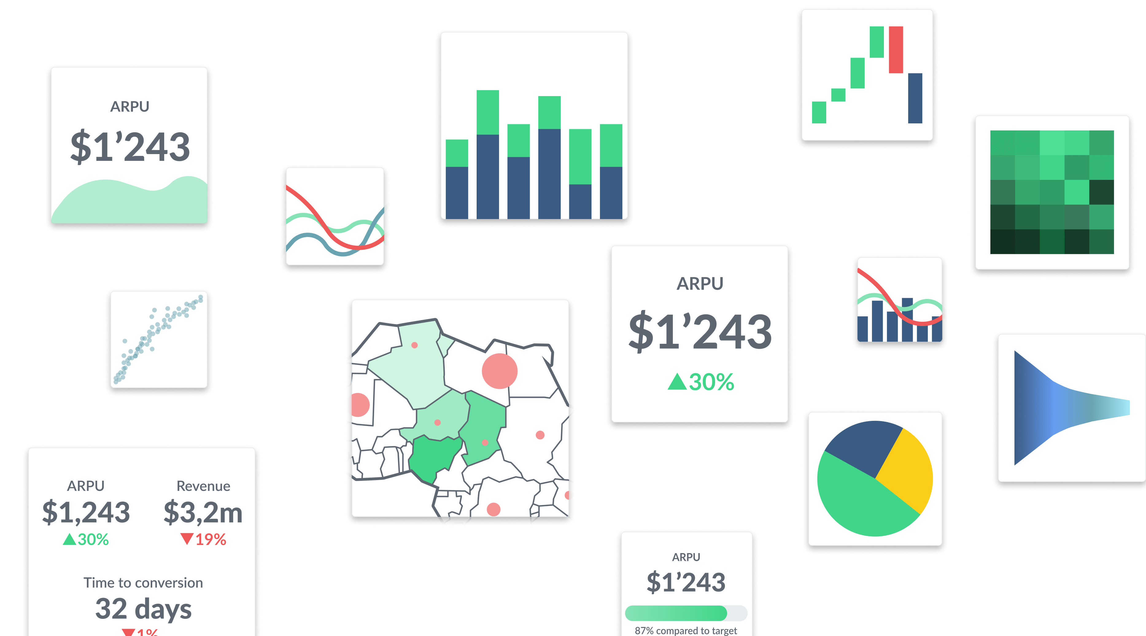
When you’re nearing the last mile, it’s important to think about how to best represent the data results in a clear, compelling way. Whaly offers a wide variety of customized formats so that you can maximize the effectiveness and impact of your data story. Visualizations with Whaly are easy to use, and easy to read. From colors and labels to various charting and graph styles, identify the ideal way to showcase your data, so that you can ultimately make the right business decisions.
Metrics
Multiple Metrics
Sparklines
Line Charts
Bar Charts
Combo Charts
Scatters
Pie Charts
Tables
Maps
Waterfalls
Gauges
Heatmaps
Funnels

Benoit Prigent
Co Founder / CPO @ Lokki
Whaly helped us create metrics on top of 6 data sources in a matter of days instead of months without technical knowledge required !!

Edouard Mascré
Co Founder @ Pennylane
We leveraged Whaly on the Sales team to build and share dashboards with ton of partners without having to continuously update things on many spreadsheets. It also gives us deeper insights on sales activity. The dashboards built can be shared with everyone in the company. Whaly saves us hours of data wrangling every day.

Benjamin Cambier
Co Founder @ Mansa
Mansa grew really fast in the past months and we were in urge of more precise metrics, especially for acquisition and deals analysis. Our engineering team was already swamped so we started our data analysis with Whaly. We compute our CAC per acquisition channel and understood at what stage the pipeline is under performing in minutes.

Quentin Lebret
VP Operations @ Klox
Whaly gave us the tools to understand how our users consume our product and helped us create a better experience for our users.

Julio Cesar Rodriguez
Operation Automation Specialist @ Career Karma
Whaly helped us create actionable experience for our SDR based on data our data team has prepped for us in dbt.

Hugo Cornu
Head of Growth @ Klox
Whaly helped us transform the way we work with data. We now back all our decision with data and can make informed decisions at any time